EOE - Energy · Solutions · Controls
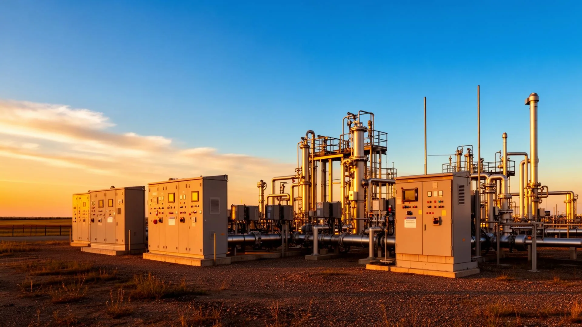
EOE had grown into three distinct Alberta-based businesses under one parent: EOE Energy (corporate umbrella), EOE Solutions (consulting, engineering, and a new combo-vac & steam/pressure-wash fleet), and EOE Controls (oil & gas electrical, automation, SCADA, and 24/7 measurement). Each division served a different buyer, but they shared one outdated identity and one cluttered website - phones rang the wrong line, RFQs landed in the wrong inbox, and the brand looked like a single contractor instead of the three-pillar industrial group EOE had become. They needed an identity system that made the divisions instantly distinguishable yet visibly part of one family, plus three purpose-built websites that each spoke fluently to their own audience.
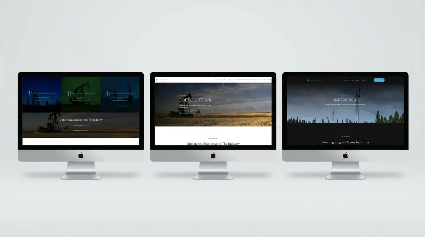
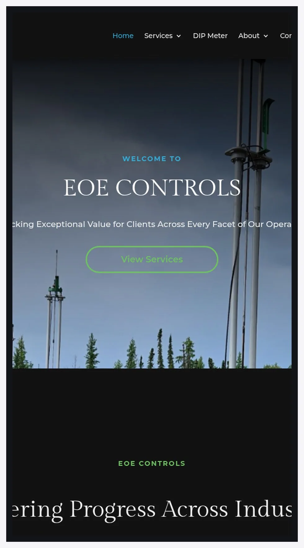
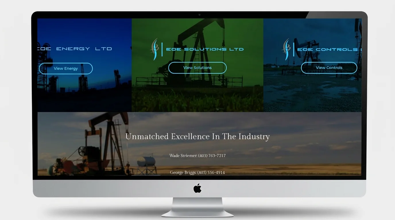
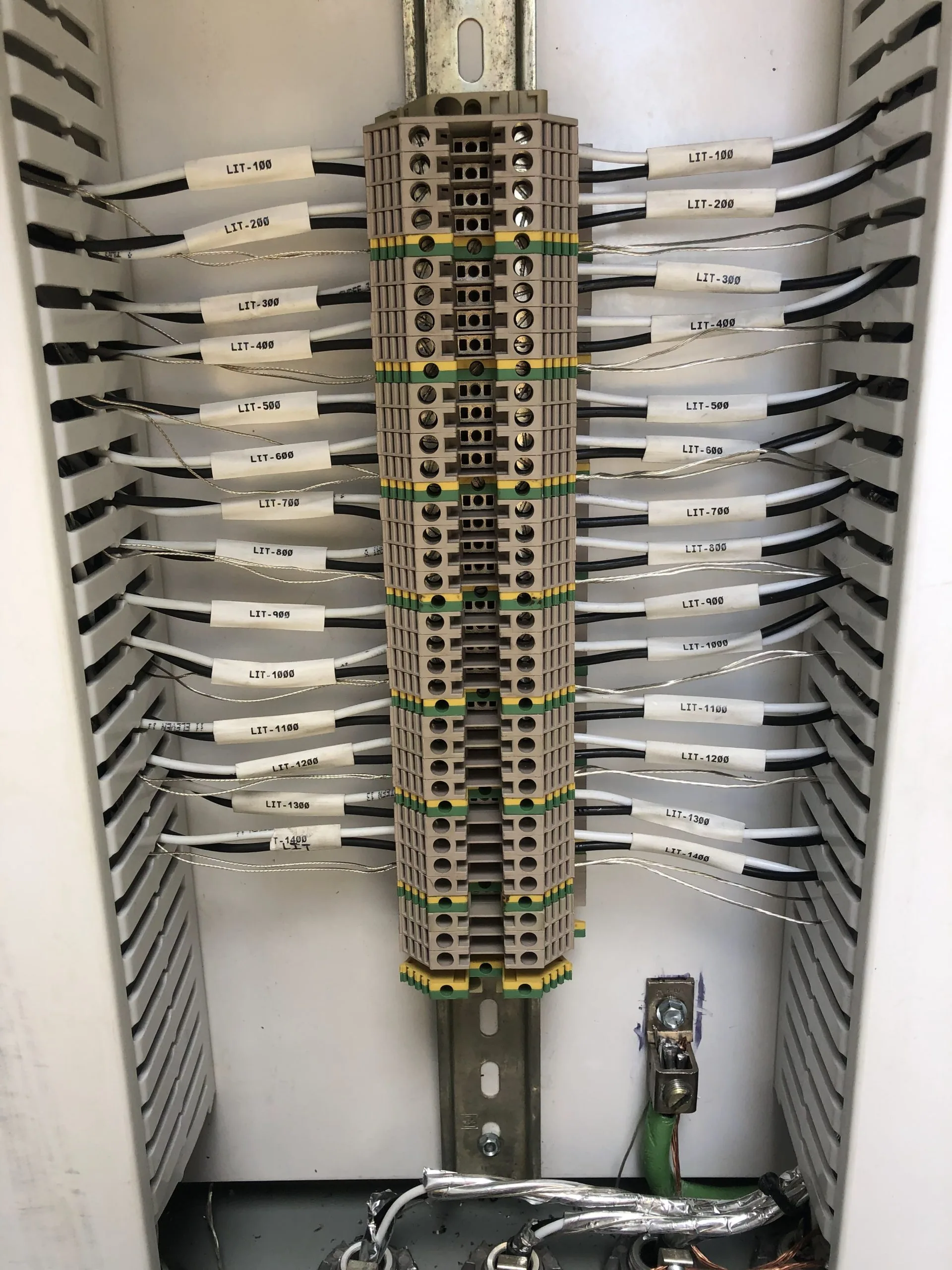
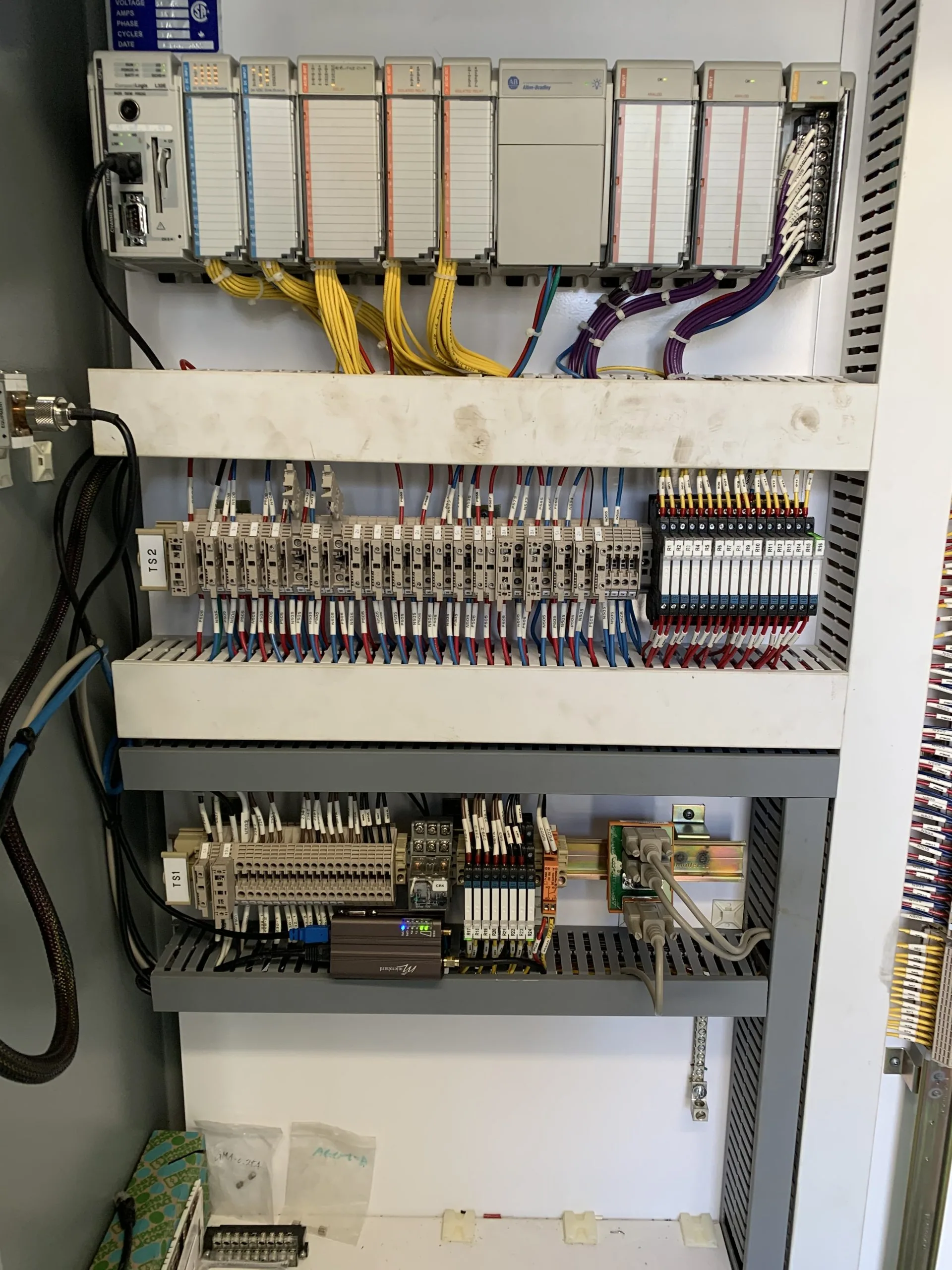
We built EOE as a true three-brand architecture under one parent mark. The shared visual DNA - a confident cyan-blue (#0099E6) carved out of industrial charcoal, geometric uppercase wordmarks, and a unified 'EOE' lockup - gives every division immediate parent-brand recognition. From there, each division gets its own focused identity expression, photography library, and dedicated website tuned to its buyer journey. EOE Energy (eoeenergy.ca) acts as the hub: a clean three-door entrance - View Energy / View Solutions / View Controls - that routes visitors directly to the right division in one click. EOE Solutions (eoesolutions.ca) leads with consulting credibility - Project Management, Facility Optimization, Regulatory & Environment, Operational Compliance, Emissions Management, plus the new Combo/Vac & Steam Clean / Pressure Wash service line - written for operators and project managers. EOE Controls (eoecontrols.ca) leads with technical depth - Construction, Maintenance, Measurement, Programming, New Builds, Engineering, and the proprietary DIP Meter - speaking directly to oil & gas automation engineers with a 24/7 support promise. Every site shares the same design language, contact patterns, and 'Unmatched Excellence In The Industry' positioning, so no matter which door a buyer enters, they land in the same trusted family.
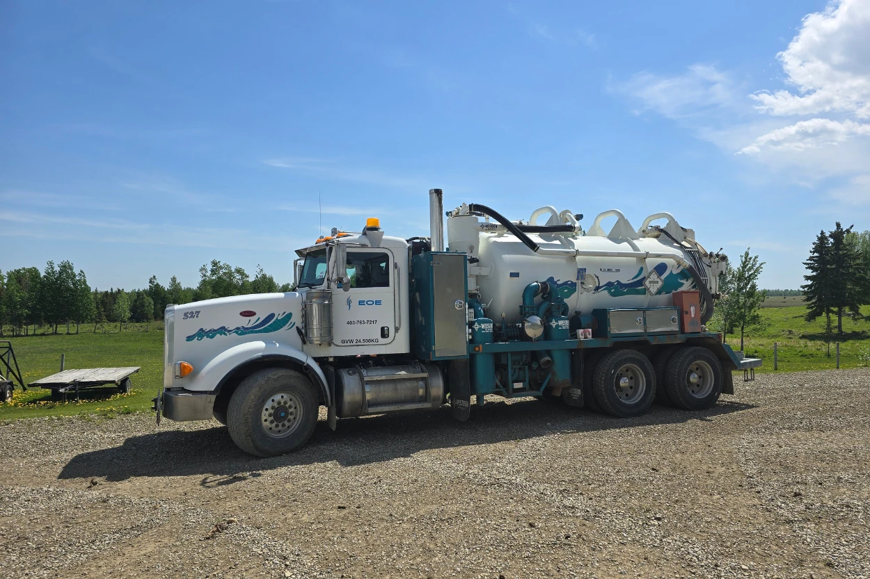
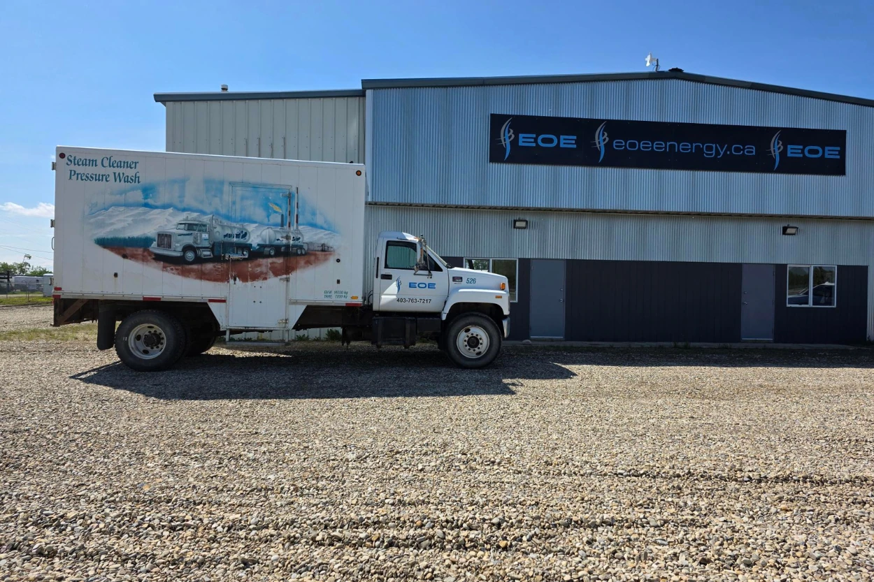
Delivered: a unified three-brand identity system (parent EOE mark + Energy / Solutions / Controls divisional lockups, full color-and-white logo libraries, brand standards), branded fleet & jobsite assets, three fully responsive websites (eoeenergy.ca as the hub, plus complete eoesolutions.ca and eoecontrols.ca division sites), service-led IA tuned to each buyer (consulting & engineering for Solutions; controls, automation & instrumentation for Controls), an integrated three-door cross-navigation pattern between the sites, dedicated service detail pages for every offering (down to DIP Meter, Combo/Vac, and Steam/Pressure Wash), 24/7 contact patterns surfacing direct field-leadership phone lines (Wade Striemer, George Briggs, Jordan Oja), and SEO architecture targeting Western Canadian oilfield procurement.
Client
EOE Energy Ltd. (Energy · Solutions · Controls)
Location
Olds & Sylvan Lake, Alberta · Canada
Services
Branding, Web Design, SEO
Industry
Oil & Gas · Engineering · Industrial Controls
Project
3-Brand Identity System + 3 Websites
The Digital Experience.
3
Connected Websites
3
Divisional Brands
1
Parent Identity System
<2s
Load Time
3
Connected Websites
3
Divisional Brands
1
Parent Identity System
<2s
Load Time
The Brand Identity.



Primary
Industrial Sans
Aa Bb Cc Dd Ee
Secondary
Open Sans
Aa Bb Cc Dd Ee
3
Brand Builds
1
Parent System
100%
Custom Design
Complete
Style Guide
Primary
Industrial Sans
Secondary
Open Sans
3
Brand Builds
1
Parent System
100%
Custom Design
Complete
Style Guide
1 Parent · 3 Brands · 3 Sites
Unified Industrial Family
EOE now presents as a credible three-pillar industrial group rather than a single contractor punching above its weight. The three sites cross-promote each other through the unified 'View Energy / View Solutions / View Controls' pattern, inbound calls finally route to the correct division on the first ring, RFQs land with the right team, and each division can market its expansions (Solutions' new Combo/Vac & Steam Clean fleet, Controls' DIP Meter and 24/7 SCADA support) without diluting the parent brand. Field teams, procurement officers, and operations managers all recognise the same EOE family across truck wraps, hard hats, and screens - and the brand finally reflects the depth of what's actually behind it.
- ↗Full three-brand identity system (EOE Energy + Solutions + Controls) under one parent mark
- ↗Three fully responsive websites - eoeenergy.ca, eoesolutions.ca, eoecontrols.ca - built to share design DNA
- ↗Three-door cross-navigation pattern routing buyers to the right division in one click
- ↗Service architecture purpose-built for each buyer (consulting/engineering vs. controls/automation)
- ↗24/7 contact and field-leadership phone lines surfaced on every site
- ↗SEO foundation targeting Western Canadian oilfield procurement and operations buyers
Boca Chicken Cafe