Hybrid Chemical Technologies
When Hybrid Chemical Technologies came to New Wave, it was a brand-new venture: a strategic partnership of manufacturing, blending, logistics, scientists, and field chemists pooled under a single banner - but with no identity, no story, and no digital presence to take that promise to market. The oil and gas industry was tightening: operators were slashing costs and cutting non-revenue roles, which meant any new chemical partner had to instantly read as credible, technical, and indispensable. Hybrid had the science and the people, but no brand to communicate it. They needed an identity that signaled innovation at the molecular level, a website that spoke fluently to drilling engineers and procurement leads, and a content architecture that could grow with them as they expanded from regional Alberta operations to a worldwide service footprint. Without that, Hybrid risked being mistaken for just another commodity-chemical reseller.
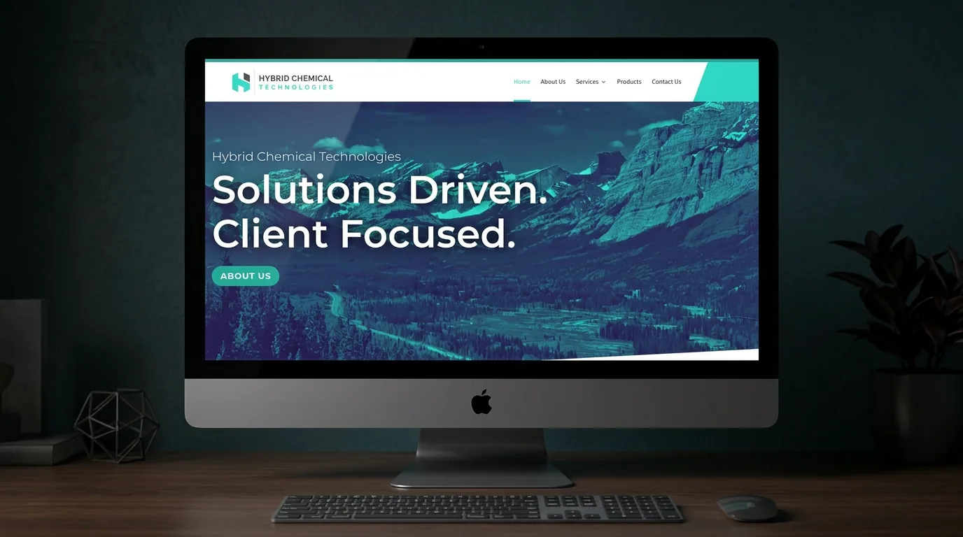
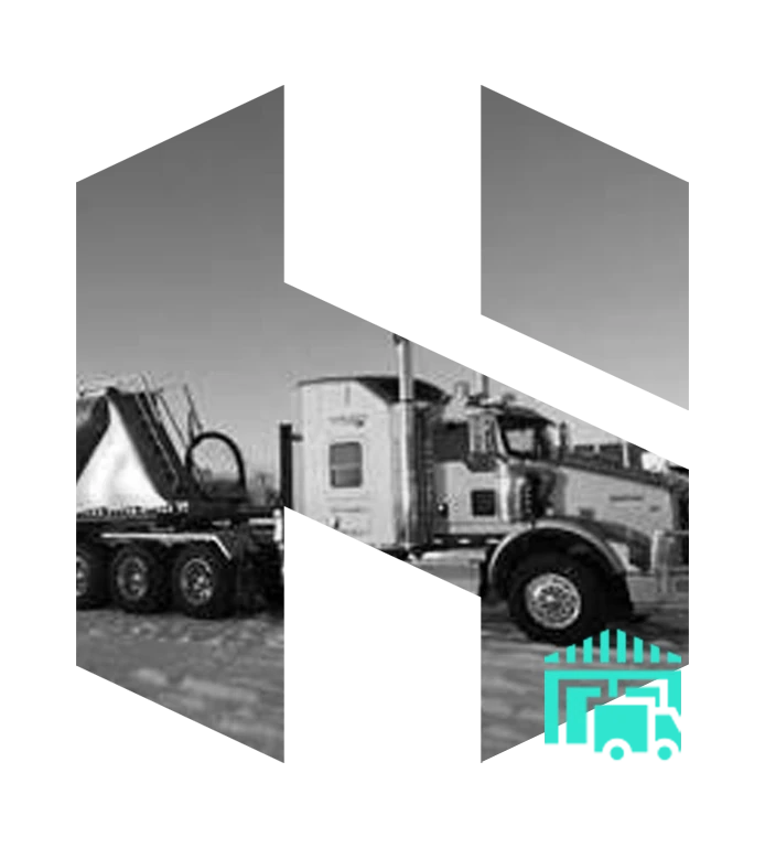
We built Hybrid from the ground up as a premium, technically-led specialty chemicals brand. The mark itself - a custom geometric 'H' constructed from two interlocking arrows - encodes the founding idea: two specialised forces (science + service) bonded into one unified solution. The wordmark pairs heavy industrial uppercase 'HYBRID CHEMICAL' with a refined letter-spaced 'TECHNOLOGIES' beneath, communicating both grit and precision. The palette commits to a single ownable signature - a vibrant teal (#2FDAC6) carved out of a deep oil-and-gas charcoal - applied with disciplined geometric slant accents on every page, every service icon, and every duotone field photograph. The brand voice was anchored to two paired promises that lead the homepage to this day: 'Solutions Driven. Client Focused.' and 'Solutions Driven. World Wide Results.' We then architected the site around how chemical buyers actually evaluate vendors - Lab Services, Field QC & Execution, Technical Advice & Consulting, Warehousing & Logistics - each presented as a duotone H-cut photographic icon so the brand mark literally frames the proof.
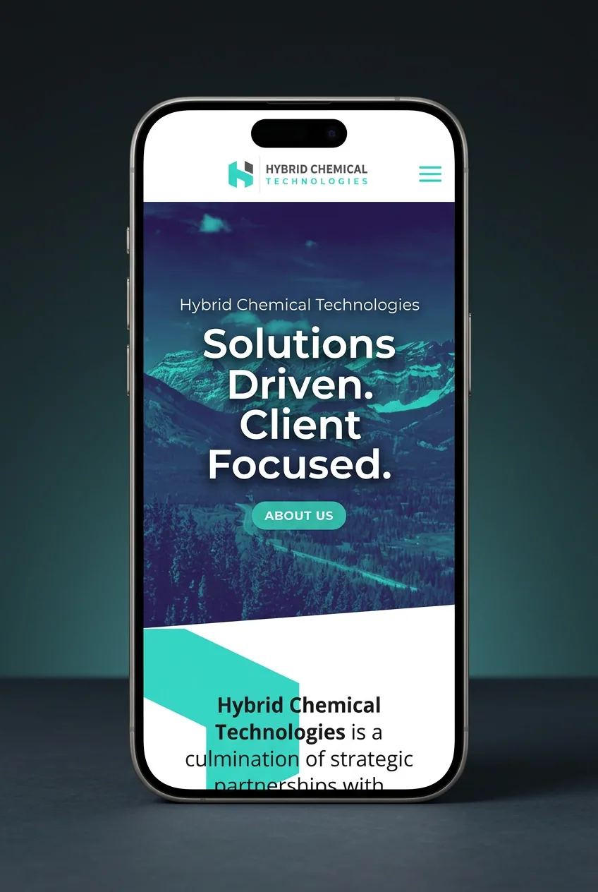
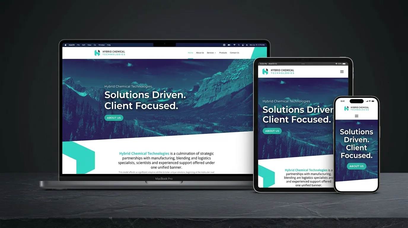
Delivered a complete brand identity (logo system, geometric slant accent language, molecule graph illustration, duotone photo treatment, brand standards), a fully responsive website (Home, About Us, Services, Products, Contact Us) with custom imagery for every service vertical, an interactive service-areas map, an in-depth product taxonomy (acid additives, acid packages, breakers, and beyond), leadership profiles led by President Peter Beaton, SEO-optimized technical content, and the ongoing digital infrastructure to support Hybrid's expansion into international markets.
Client
Hybrid Chemical Technologies
Location
Calgary, AB · Canada (Worldwide Operations)
Services
Branding, Web Design, SEO
Industry
Oil & Gas · Specialty Chemicals
Project
Brand Identity + Website + Ongoing Digital
The Digital Experience.

 HomeAbout UsServicesProductsContact Us
Day 1
Brand Built from Zero
Worldwide
Service Footprint
<2s
Page Load
100%
Custom Design
Day 1
Brand Built from Zero
Worldwide
Service Footprint
<2s
Page Load
100%
Custom Design
The Brand Identity.


Lab Services

Field QC

Technical
Logistics
Primary
Source Sans Pro
Aa Bb Cc Dd Ee
Secondary
Source Sans Pro
Aa Bb Cc Dd Ee
Day 1
Built from Zero
Custom
H Monogram
Single
Ownable Teal
Complete
Brand Standards
Primary
Source Sans Pro
Secondary
Source Sans Pro
Day 1
Built from Zero
Custom
H Monogram
Single
Ownable Teal
Complete
Brand Standards
Worldwide
Results from a Day-One Brand
What launched as a startup partnership is now a globally-active specialty chemicals operation with a brand that punches well above its weight - frequently mistaken for a multi-decade incumbent. The H-mark and teal-on-charcoal system have become genuinely ownable in the oil and gas chemicals category, the website continues to convert technical buyers years after launch with virtually no redesign required, and Hybrid grew from regional Alberta service into a worldwide-results operator. The brand we built on day one is still the brand they scale on today - proof that strategy-first identity work compounds.
- ↗Full brand identity built from zero - logo system, palette, geometric language, brand standards
- ↗Custom geometric 'H' mark encoding the strategic-partnership founding idea
- ↗Signature teal-on-charcoal palette ownable in the oil & gas chemicals category
- ↗Service architecture organized as duotone H-framed icons (Lab, Field, Technical, Logistics)
- ↗Scaled with the company from Alberta startup to worldwide operations - no rebrand required
- ↗Ongoing partnership with New Wave maintaining digital, content, and SEO performance

Live Life Better - Glow Health & Vitality